

Opened 9 years ago
Last modified 6 years ago
#15240 closed enhancement
transform gui icons to svg — at Version 72
| Reported by: | Klumbumbus | Owned by: | team |
|---|---|---|---|
| Priority: | major | Milestone: | 20.08 |
| Component: | Core | Version: | |
| Keywords: | svg png icon ex-longterm | Cc: |
Description (last modified by )
Since we have an icon scaling on hidpi screens now (ticket:9995#comment:110) it would be nice to transform all icons to svg. Preset icons are already all svg (#13357)
Here are the current numbers: 60 svg icons and 270 png icons. This statistic excludes the folders images/presets, images/icons (only potlatch icons), our logo (which exists 6 times as png versions additionally to svg) and two special cases (lambert maps).
svg:
![]()
png:
![]()
I think we could ask the osm community for help on this subject.
There are two possibilities:
- transform the 270 png to svg
- create a whole new icon set with an consistent look
For the second, there was already such an (not fully complete) dataset, see JOSM themes:


progress since creation of this ticket:
Change History (117)
by , 9 years ago
| Attachment: | png_icons.png added |
|---|
by , 9 years ago
| Attachment: | svg_icons.png added |
|---|
comment:1 by , 9 years ago
| Keywords: | svg png icon added |
|---|---|
| Priority: | normal → major |
comment:2 by , 9 years ago
| Description: | modified (diff) |
|---|
comment:3 by , 9 years ago
follow-up: 6 comment:4 by , 9 years ago
FYI, as long as Dropbox has changed sharing mechanics, theme files are now available at:
https://drive.google.com/file/d/0BzTaubB85qV2cEFPcnA2UTBZbG8/view?usp=sharing
And I'm searching for the source files now.
comment:5 by , 9 years ago
Our current icons are partly based on the Tango icon theme, which has an svg set. See also GNOME set (based on Tango) with icons for download, delete and others.
comment:6 by , 9 years ago
Replying to Felis Pimeja:
FYI, as long as Dropbox has changed sharing mechanics, theme files are now available at:
https://drive.google.com/file/d/0BzTaubB85qV2cEFPcnA2UTBZbG8/view?usp=sharing
And I'm searching for the source files now.
Wow, it's pretty good! I like the black-red color scheme.
by , 9 years ago
| Attachment: | black-red.jpg added |
|---|
by , 9 years ago
| Attachment: | blue-red.jpg added |
|---|
by , 9 years ago
| Attachment: | monochrome.jpg added |
|---|
by , 9 years ago
| Attachment: | standart.jpg added |
|---|
comment:7 by , 9 years ago
| Description: | modified (diff) |
|---|
comment:8 by , 9 years ago
See also new default theme for Gnome 3: https://git.gnome.org/browse/adwaita-icon-theme/
comment:9 by , 9 years ago
The colorschemes like black-red do look good, but in my eyes they aren't good as the standard design. This should still be colorful (when possible with a bit more unified style :-).
follow-up: 11 comment:10 by , 9 years ago
How to move forward?
I noticed that some of the vector icons don't scale well down to very small sizes:
Current download icon (24x24px):

Scalable image, rendered at 48x48 px:

Scalable image, rendered at 24x24 px

Just replacing the current download.png by download.svg would be nice for HiDPI users, but clearly is a loss in image quality for everyone else. My conclusion so far is that some scalable images are designed with a certain minimum size in mind and will just look bad when scaled below that limit. This affects some icons more than others, the undo/redo image scales fine for example.
Possible solutions:
- Find svg icons that scale well to 24x24 px (and decently well to 16x16 px for the menus).
- Ship both the 24x24px "pixel art" and the .svg and use whatever image is better suited.
follow-up: 12 comment:11 by , 8 years ago
Replying to bastiK:
Possible solutions:
- Find svg icons that scale well to 24x24 px (and decently well to 16x16 px for the menus).
- Ship both the 24x24px "pixel art" and the .svg and use whatever image is better suited.
I don't think we will succeed to find good SVG icons scalable to small sizes. It's already difficult enough to find a SVG version. This leaves only the second option.
follow-up: 13 comment:12 by , 8 years ago
Replying to Don-vip:
Replying to bastiK:
Possible solutions:
- Find svg icons that scale well to 24x24 px (and decently well to 16x16 px for the menus).
- Ship both the 24x24px "pixel art" and the .svg and use whatever image is better suited.
I don't think we will succeed to find good SVG icons scalable to small sizes. It's already difficult enough to find a SVG version. This leaves only the second option.
- Change the icons, so that the vanishing elements (usually some sort of boundaries) are wider, so they don't vanish.
E.g. see point 7 here: https://www.creativebloq.com/how-to/10-golden-rules-for-responsive-svgs
follow-up: 14 comment:13 by , 8 years ago
Replying to stoecker:
Replying to Don-vip:
Replying to bastiK:
Possible solutions:
- Find svg icons that scale well to 24x24 px (and decently well to 16x16 px for the menus).
- Ship both the 24x24px "pixel art" and the .svg and use whatever image is better suited.
I don't think we will succeed to find good SVG icons scalable to small sizes. It's already difficult enough to find a SVG version. This leaves only the second option.
- Change the icons, so that the vanishing elements (usually some sort of boundaries) are wider, so they don't vanish.
E.g. see point 7 here: https://www.creativebloq.com/how-to/10-golden-rules-for-responsive-svgs
This is more the job of a graphics designer that that of a programmer. Take the download icon posted above as an example: How can you modify the SVG without loss of quality in either the 24 px (top) or the 48 px rendering?
Anyway, if we implement option 2, it is still possible to improve the SVGs one by one, as suggested.
comment:14 by , 8 years ago
This is more the job of a graphics designer that that of a programmer. Take the download icon posted above as an example: How can you modify the SVG without loss of quality in either the 24 px (top) or the 48 px rendering?
Anyway, if we implement option 2, it is still possible to improve the SVGs one by one, as suggested.
Sure.
But the option 2 means a workaround which again will live MANY years. I personally would rather accept slightly worse low-zoom icons than another workaround.
comment:15 by , 8 years ago
P.S. We already had 24x24 menu icons. Maybe default simply should be 30x30 nowadays even for normal screens?
by , 8 years ago
| Attachment: | statusline.gif added |
|---|
Animated comparison between the statusline icons (current and proposed)
comment:16 by , 8 years ago
I propose to replace the icons in the statusline with SVG versions.
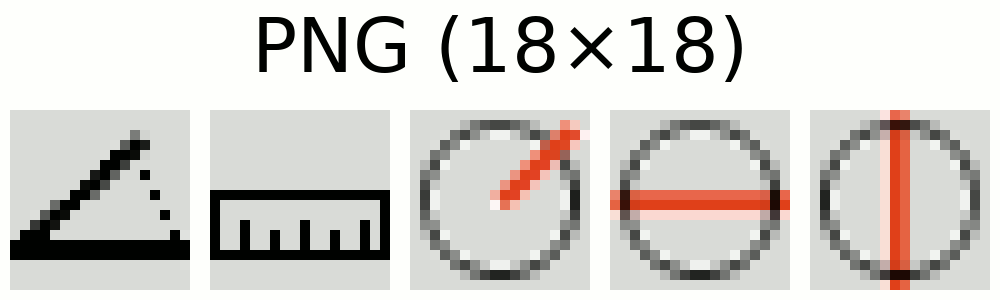
Below you see a comparison between the current icons (PNG, 18×18 pixels, scaled to 180×180), then how my proposed SVG icons look when converted to a 18×18 raster image scaled up to 180×180 pixels. And finally how the SVG icons look as 180×180 pixel image.
")
(https://josm.openstreetmap.de/attachment/ticket/15240/statusline-svg.patch is the corresponding patch)
by , 8 years ago
| Attachment: | statusline-before.png added |
|---|
Current appearance of the statusline icons
by , 8 years ago
| Attachment: | statusline-after.png added |
|---|
Proposed appearance of the statusline icons


comment:19 by , 8 years ago
No need to do such a impressive presentation. :) The new images and a before/after is enough. We plan to replace all PNG images anyway.
comment:21 by , 8 years ago
References to the old PNG-files are still used in the wiki, please see https://josm.openstreetmap.de/wiki/Help/StatusBar
Wiki has been updated.
by , 8 years ago
| Attachment: | anglesnap.svg added |
|---|
by , 8 years ago
| Attachment: | alignline.svg added |
|---|
comment:25 by , 8 years ago
Here are four more:


By the way: Can the icons dialogs/valid  and
and misc/check_large  also be replaced by the checkmark above or is there a need for three different green checkmarks?
comment:27 by , 8 years ago
I didn't replace misc/check_large. It is used in the upload dialog and I'd say it looks better there than the boxy green_check.

by , 8 years ago
| Attachment: | 246png.png added |
|---|
comment:29 by , 8 years ago
Hmm, are sure that's right? The green check is svg and the large is missing and some icons are in two sizes and 3 blue checkmarks?
follow-up: 34 comment:31 by , 8 years ago
It seems you accidently moved the large green check to nodist instead of ![]() .
.
comment:32 by , 8 years ago
in the screenshot I scaled all icons to 24px. multiple icons appear when there are different sizes available, e.g. ![]()
![]()
![]()
![]()
![]()
![]()
should be unified when replayed by svg
comment:33 by , 8 years ago
Code of the screenshot. Can be used here in wiki with comment preview feature. (But takes a bit to load all images which is why I made the screenshot)
edit: code outdated and removed
comment:34 by , 8 years ago
Replying to Klumbumbus:
It seems you accidently moved the large green check to nodist instead of
.
Ooops. Can someone please fix this before next build?
follow-up: 37 comment:35 by , 8 years ago
could be a meme: JOSM user level expert: knows the difference between the upload icon and the upload selection icon


comment:37 by , 8 years ago
Replying to Klumbumbus:
could be a meme: JOSM user level expert: knows the difference between the upload icon and the upload selection icon
hahaha :D
comment:38 by , 8 years ago
And some more:
![]()
![]()
![]()
![]()
![]()
![]()
![]()
![]()
![]()
![]()
![]()
![]()
![]()
![]()
![]()
![]()
The last one I changed, because the line around really should be the circle (I think), not the ways connecting the nodes. So I changed the color (if you want some other color, we could change it). And I made the points more irregular to emphasize that the nodes are not evenly distributed around a circle, but only moved to the closest point on a circle.
follow-up: 40 comment:39 by , 8 years ago
Hmm. taginfo does still not look nice. It's the website favicon, but looks ugly. Adding the world logo from the website behind the ti?
comment:40 by , 8 years ago
Replying to stoecker:
Hmm. taginfo does still not look nice. It's the website favicon, but looks ugly. Adding the world logo from the website behind the ti?
Don't know if that would work at this resolution (16x16). Probably has to be something simpler.

comment:43 by , 8 years ago
https://www.google.de/search?q=icon+tag
They all have a hole inside.
Or simply such a tag with an i or ti inside. When we have something better we'd need to ask Jochen if he likes it.
comment:44 by , 8 years ago
Or we pixel align the current taginfo icon a bit to make it look a bit sharper.
Regarding 
 I agree that there should be a circle in the icon instead of a pentagon to better illustrate the align in circle action. However the irregular pattern destroys this illustration again a bit in my opinion. And if you select a way and hit
 O then the nodes are indeed evenly distributed. The thin light green is pretty hard to recognize on a light background too.
Currently Help/Action/AlignInCircle and Help/Action/CreateCircle use the same icon. While the align action works on single nodes too, the create action always creates a way, so probably the black way lines shouldn't be removed from the create action icon.
My suggestion (but I didn't test how it looks): a circle and even distributed nodes for both icons; for the create action the circle is black and for the align action grey or another color (but a bit darker than the light green).
follow-up: 46 comment:45 by , 8 years ago
Here's my draft for an alternative TagInfo logo:

And another version of aligncircle:  .
.
@Klumbumbus: Actually it depends on what you select if the nodes distribute equally around the circle: When selecting a way, they do. When selecting only the nodes, they do not distribute evenly around the circle. I thought they were always only jumping to their nearest position on the circle, but it seems to be more complicated.
Anyway, I now changed the icon to show evenly distributed nodes, also for aesthetic reasons. Also the color is now grey. I think a second version in black would be too much, especially because they are too similar… Not that in the end your joke about the download icons really becomes a meme 😉
follow-up: 57 comment:46 by , 8 years ago
Replying to floscher:
Here's my draft for an alternative TagInfo logo:
I contacted Jochen and asked for his opinion.
comment:48 by , 8 years ago
(replacement for gray_check.png  can be derived from the green and blue one too)
comment:49 by , 8 years ago
You might consider renaming gray_check.svg to grey_check.svg. Next to it there is the file grey_x.png, which uses the other spelling.
follow-up: 51 comment:50 by , 8 years ago
On Plugins the images /browser/trunk/images/misc/black_x.png and ../green_check.png are missing now.
They are placed by a script in the last column to indicate if a plugin needs a restart. The alt parameters for the images are localized. This script needs to be modified.
Replacing the former PNG images with their SVG counterparts will make the page display in the Help Browser worse, because that Browser can't properly resize images currently. Simple characters like ✓ and ✕ may give the same information.
follow-up: 52 comment:51 by , 8 years ago
Did someone fix this already? The icons are displayed fine for me. (I remember that i fixed wiki:JavaBugs and wiki:OldJavaBugs 5 weeks ago and I think that the Plugins page was already working fine a that point.)
Replying to Hb---:
Replacing the former PNG images with their SVG counterparts will make the page display in the Help Browser worse, because that Browser can't properly resize images currently.
That shouldn't be a problem anyway in this case as these two icons have a small base size and shouldn't be resized.


comment:57 by , 8 years ago
comment:58 by , 8 years ago
Another thing: the icon warnings scripts says bookmark.svg is not used, but it is:
        static ImageIcon getDefaultIcon() {
            return ImageProvider.get("dialogs", "bookmark", ImageSizes.SMALLICON);
        }
comment:59 by , 8 years ago

Jochen sent me this image which he also uses (which is to large for our purpose), but didn't answer whether he likes or does not like the small icon.
I'd say we simply use floscher's icon in JOSM.
by , 8 years ago
| Attachment: | taginfo_preview.png added |
|---|
comment:61 by , 8 years ago
It's nice but the contrast should be increased, it's hard to view the tag on grey background:

by , 8 years ago
| Attachment: | taginfo_preview2.png added |
|---|
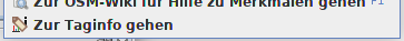
Preview of the context menu with TagInfo logo

by , 8 years ago
| Attachment: | rectangle.svg added |
|---|
by , 8 years ago
| Attachment: | normal.svg added |
|---|
comment:66 by , 8 years ago
Replacements for some icons in the directory images/cursor/modifier:


As well as these two in images/cursor:


by , 8 years ago
| Attachment: | crosshair.2.svg added |
|---|
by , 8 years ago
| Attachment: | crosshair.svg added |
|---|
follow-up: 69 comment:68 by , 8 years ago
Did you accidently not pixel align the red node symbols at these three icons?
by , 8 years ago
| Attachment: | select_add.svg added |
|---|
by , 8 years ago
| Attachment: | selection.svg added |
|---|
by , 8 years ago
| Attachment: | select_node.svg added |
|---|
by , 8 years ago
| Attachment: | select_node_add.svg added |
|---|
by , 8 years ago
| Attachment: | select_node_remove.svg added |
|---|
by , 8 years ago
| Attachment: | select_remove.svg added |
|---|
by , 8 years ago
| Attachment: | select_way.svg added |
|---|
by , 8 years ago
| Attachment: | select_way_add.svg added |
|---|
by , 8 years ago
| Attachment: | select_way_remove.svg added |
|---|
comment:69 by , 8 years ago
Replying to Klumbumbus:
Did you accidently not pixel align the red node symbols at these three icons?
Yes, good catch, thank you! I corrected the icons. And I also made a small modification to the other select-modifiers, which shouldn't change the appearance in JOSM, but in some image viewing programs (e.g. Gimp) the dashed line should display correctly.
comment:71 by , 8 years ago
@bastiK @michael2402 The test MapCSSRendererTest.testRender[area-fill-image] is both failing and slower on Jenkins since r13862, could you please have a look? Surprisingly the test is OK on my machine.
comment:72 by , 8 years ago
| Description: | modified (diff) |
|---|
add progress chart to ticket description, little motivation ;)
Replying to Klumbumbus:
I remember very well. Felis was one of the finalists for the LogoContest and he almost won. It was really a hard thing to choose between the two final designs. I love what he did, too bad we can't have two logos :D
I just sent him an e-mail to let it know about this ticket.