

Opened 11 years ago
Closed 10 years ago
#12296 closed enhancement (fixed)
New preset icons in svg - waypoints and waterways
| Reported by: | zermes | Owned by: | team |
|---|---|---|---|
| Priority: | normal | Milestone: | 16.02 |
| Component: | Internal preset | Version: | |
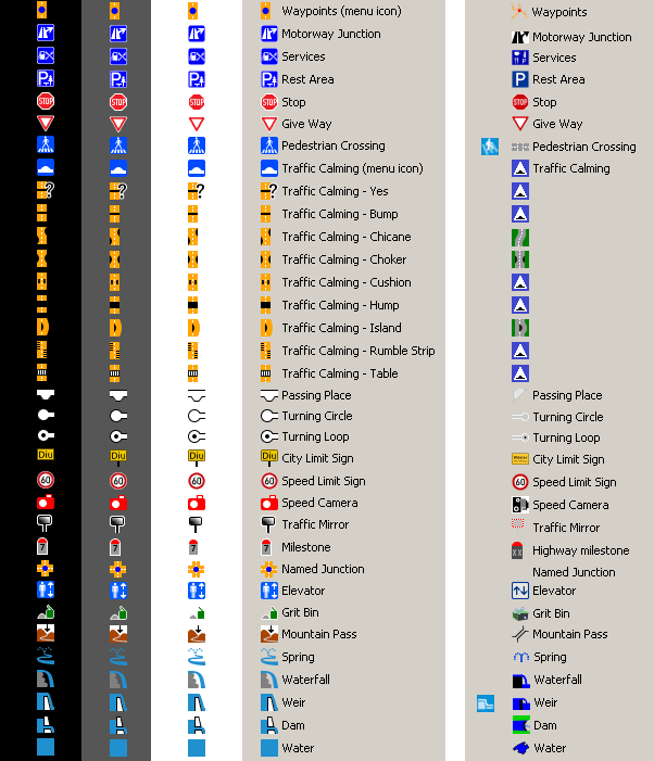
| Keywords: | icon svg preset amenity grit bin pedestrian crossing elevator give way highway milestone motorway named junction passing place rest area services speed camera stop turning circle loop mountain pass named junction traffic calming bump chicane choker cushion hump island rumble strip table city limit sign maxspeed speed traffic mirror waypoints natural water waterway dam spring waterfall weir | Cc: | Klumbumbus, lists@… |
Description
A few more. Passing place seems upside down since don't want someone thinking it's a bump. The speed camera and grit bin are not very good, I've made a few icons and those were the best I could make. The blue color of the water icons seems acceptable, I've made some changes to them to have more contrast and was getting worst. And the spring icon...well, weird icon but at least now is not similar to fountain icon.
As always, released in CC0/Public Domain
Attachments (9)
Change History (37)
by , 11 years ago
| Attachment: | JOSM_icons_waypoints_and_waterways.png added |
|---|
by , 11 years ago
| Attachment: | JOSM_svg_icons_waypoints_and_waterways.7z added |
|---|
comment:1 by , 11 years ago
comment:2 by , 11 years ago
| Milestone: | → 16.02 |
|---|
comment:3 by , 11 years ago
| Cc: | added |
|---|
by , 11 years ago
| Attachment: | JOSM_svg_icons_waypoints_and_waterways_v2.7z added |
|---|
comment:5 by , 11 years ago
| Cc: | added |
|---|
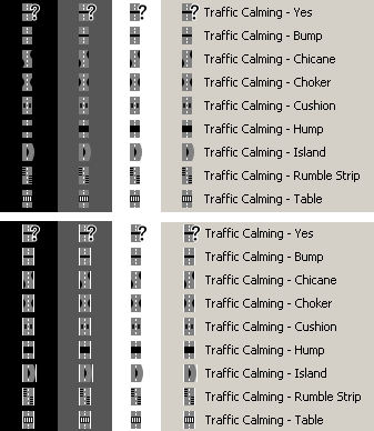
follow-up: 8 comment:6 by , 10 years ago
Just a question, why did you choose yellow for most of the street icons?
comment:7 by , 10 years ago
can't we keep gray for traffic calming? (maybe with a small halo). Yellow/Orange could be confused with power icons, and gray is adapted for a road feature
by , 10 years ago
| Attachment: | JOSM_icons_traffic_calming_v3.png added |
|---|
by , 10 years ago
| Attachment: | JOSM_svg_icons_waypoints_and_waterways_v3.7z added |
|---|
comment:8 by , 10 years ago
Replying to Klumbumbus:
Just a question, why did you choose yellow for most of the street icons?
Because is easier if I use a color instead of black, white or grey to distinguish from the menu background color, usually in grey near to the white or near to the black (win,osx,linux...). For example, I changed to grey and now they haven't high contrast. So usually, in grey I put an halo like Don-vip suggested, but in this case the halo is much worst, so I hope the ones without the halo are acceptable (much better and simple when a color is used) as we can see in the next image.
Note: I've attached the icons shown first in the next image and not the last ones with the halo, it's just to show them. This last file attached has all icons, including the ones I didn't changed this time.
![]()
by , 10 years ago
| Attachment: | JOSM_svg_icons_waypoints_and_waterways_v4.7z added |
|---|
comment:9 by , 10 years ago
Forgot to change the color to grey also in Waypoints (menu icon) and Named Junction.
comment:11 by , 10 years ago
| Owner: | changed from to |
|---|---|
| Status: | new → assigned |
follow-up: 19 comment:13 by , 10 years ago
I prefer to use the same icon for the preset menu and the mapview, so I copied traffic_calming.svg and crossing.svg to the no_dist folder, because they are not needed.
by , 10 years ago
| Attachment: | calming_combo.png added |
|---|
follow-up: 15 comment:14 by , 10 years ago
Hm. I just wanted to proudly announce the first JOSM combo box with icons, but then I noticed, that it doesn't look as good as expected :)

Possible solutions to unglue the icons:
- rotate them 90°
- cut 1 pixel at the top and bottom of each icon
- make the lines higher
Any better ideas?
comment:15 by , 10 years ago
Replying to Klumbumbus:
Any better ideas?
Handle this in the Java code :) Don't touch the icons they're great!
comment:17 by , 10 years ago
There was an weird error with the weir icon ;)
I fixed it by copying the data into a new inkscape document see [o31998]
comment:18 by , 10 years ago
| Owner: | changed from to |
|---|---|
| Status: | assigned → new |
follow-up: 21 comment:19 by , 10 years ago
Replying to Klumbumbus:
I prefer to use the same icon for the preset menu and the mapview, so I copied traffic_calming.svg and crossing.svg to the no_dist folder, because they are not needed.
About crossing.svg the problem with this one is being obtrusive right? I can make one very similar but a bit better than the existing one.
comment:20 by , 10 years ago
I was reviewing one area when I saw this:

And thought "maybe they are some highway=crossing without crossing_ref or some other kind of information missing on them".
But then I saw that in fact they are two traffic_calming=hump
I see two problems here:
1) the black bar representing the hump gives the impression that something is missing or incomplete
2) it's not easy to say that this is actually a hump (while the old icon was "uglier", it was easy to say that it was a hump/bump)
Is it possible to somehow improve this, please?
I guess with something like this:

The same case for traffic_calming=bump (but thinner)
comment:21 by , 10 years ago
Replying to zermes:
About crossing.svg the problem with this one is being obtrusive right?
Rather that we already have specific svg crossing icons and the preset icon should be one of those for consistency. So there is no need for a different general crossing icon.
by , 10 years ago
| Attachment: | JOSM_icons_crossing_bump_hump.png added |
|---|
follow-up: 23 comment:22 by , 10 years ago
Klumbumbus, it's just I can't see a crossing in that icon. I know not all crossing are zebras, but it's the most easily identifiable pattern. See the 2 examples.
naoliv, what about the 2 last ones with bump and hump in grey?
![]()
comment:23 by , 10 years ago
Replying to zermes:
Klumbumbus, it's just I can't see a crossing in that icon.
It is the default street marking for a crossing, which you can see (similar) on all the photos at Key:crossing (except the last two of course). Often this marking is present also when there is an additional zebra marking. See https://www.google.de/search?hl=de&biw=1680&bih=908&gbv=2&tbm=isch&sa=1&q=pedestrian+crossing&oq=pedestrian+crossing Or see this example: http://media05.myheimat.de/2009/08/21/686854_web.jpg?1250885666
naoliv, what about the 2 last ones with bump and hump in grey?
The grey ones look good.
comment:24 by , 10 years ago
Klumbumbus, right! forgot that.
I don't know if I should say this: (more work to me and JOSM developers) should I try to create individual crossing icons like I did for traffic calming? At least for "Crossing type name (UK)" like pelican, tuffin, tiger, toucan and zebra. They could be shown in JOSM combo box with icons too. Don't know if in this case is a good idea, different icons all over the place...although would be nice to see exactly what type of crossing is.
I've annexed bump and hump icons in grey:
by , 10 years ago
| Attachment: | JOSM_svg_icons_traffic_calming_bump_hump__CC0_Public_Domain.7z added |
|---|
comment:26 by , 10 years ago
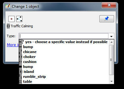
I just thought that it would be better to add an own preset for each traffic_calming type. With an additional group it doesn't add clutter to the waypoint group an it has the advantage that the Tags/Membership and Selection dialogs display the correct icon and prevents from using yes as value.
comment:28 by , 10 years ago
| Resolution: | → fixed |
|---|---|
| Status: | new → closed |
Here is a preview of new ones and the actual ones:
