Opened 17 years ago
Closed 15 years ago
#2922 closed enhancement (fixed)
[Patch] Improve visibility of preset entry in properties dialog
| Reported by: | Owned by: | team | |
|---|---|---|---|
| Priority: | minor | Milestone: | |
| Component: | Core | Version: | latest |
| Keywords: | Cc: |
Description
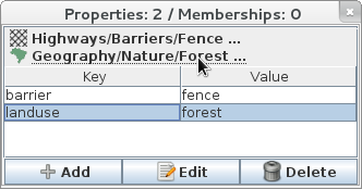
The preset link in the properties dialog (Alt+Shift+T) doesn't look like a link. It's not at all obvious unless you know what it does that you can click on it.
It's black and in a bold font and when you hover over it the font gets rendered in a normal font width.
Instead it should be in anchor-blue and underlined. Exactly like the links in JOSM's own Help->About dialog.
Attachments (2)
Change History (9)
follow-up: 2 comment:1 by , 16 years ago
| Resolution: | → fixed |
|---|---|
| Status: | new → closed |
comment:2 by , 16 years ago
comment:3 by , 16 years ago
| Resolution: | fixed |
|---|---|
| Status: | closed → reopened |
| Summary: | Preset link in properties dialog doesn't look like a link → Improve visibility of preset entry in properties dialog |
| Type: | defect → enhancement |
comment:4 by , 16 years ago
The text above the proporties (dialogue Alt+Shift+P) is not a link to an internet page. It is a short cut the used preset.
My suggestions:
- add an icon to the current preset. ( [ICON] Preset )
- add the three dots at the end of the line
- highlight the background of the line in case of mouse over
by , 15 years ago
| Attachment: | 2922.patch added |
|---|
by , 15 years ago
| Attachment: | 2922.screenshot.png added |
|---|
comment:6 by , 15 years ago
| Summary: | Improve visibility of preset entry in properties dialog → [Patch] Improve visibility of preset entry in properties dialog |
|---|


Replying to stoecker:
Perhaps you closed the wrong bug? The links looks the same and I can't find anything in the timeline that touched it today.
FWIW I tried to fix this myself some time ago but couldn't figure out how to tie in the Java font/color styling classes with the classes used to construct the link.