Tower preset icons recolor
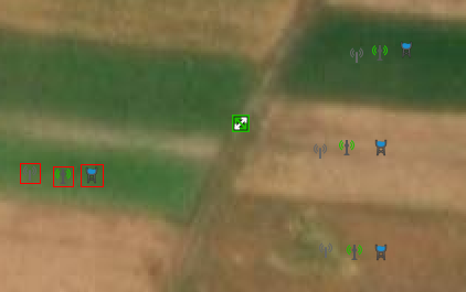
Current tower icons are nice because they adhere to the same style while still conveying meaning. The problem is, they are hardly readable on top of satellite imagery (like Esri) because all of them are flat grey. I've missed a water tower more than once, and communication towers can often be spotted only by labels (if present).
I suggest a slight recolor to add contrast. So that even if the entire shape is hard to spot, there is a sense that *something* is there.
Here are some examples for communication towers/masts and the water tower (I've reused green from the "telecom" preset — one of these icons is included in the middle for comparison, and blue from the "nautical" preset to maintain the color scheme). I've also attached a screenshot with Esri enabled to show the difference.
Change History
(11)
| Component: |
Core → Internal preset
|
| Resolution: |
→ fixed
|
| Status: |
new → closed
|






Ideally, I would do something similar to all the icons in this preset (lighting, cooling tower, telescope etc), but
1) I don't know how exactly to avoid making them garish and preserve the form/idea
2) I believe these are less critical (except maybe lighting) because cooling towers and telescopes are normally big enough to be mapped as polygons, so the icon is only displayed in JOSM menu