

Opened 5 years ago
Last modified 5 years ago
#20708 closed enhancement
Re-organize the upload dialog — at Version 4
| Reported by: | simon04 | Owned by: | simon04 |
|---|---|---|---|
| Priority: | normal | Milestone: | 21.04 |
| Component: | Core | Version: | |
| Keywords: | upload dialog | Cc: |
Description (last modified by )
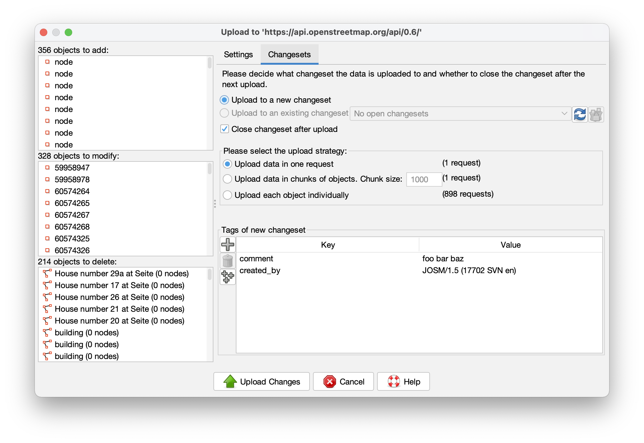
The current upload dialog wastes plenty of space (typical monitors have a 16:9 or 16:10 aspect ratio).
I propose to make the wider, and to use a vertical split for displaying the object lists and the settings:


Fixes #4144.
Change History (7)
by , 5 years ago
| Attachment: | Screenshot 2021-04-03 at 12.17.57.png added |
|---|
by , 5 years ago
| Attachment: | Screenshot 2021-04-03 at 12.18.02.png added |
|---|
comment:1 by , 5 years ago
| Description: | modified (diff) |
|---|
comment:2 by , 5 years ago
comment:3 by , 5 years ago
My observations:
- the 'Tags of new changeset' part not aligned to the bottom of the window
- the 'Settings' tab meaning a bit overlaps with 'Changesets' because both are a changeset property. Maybe reword to Description and Settings? Take into consideration that I'm not a native speaker.
comment:4 by , 5 years ago
| Description: | modified (diff) |
|---|
by , 5 years ago
| Attachment: | Screenshot 2021-04-03 at 14.04.21.png added |
|---|
Note:
See TracTickets
for help on using tickets.
Great idea, I was thinking the same recently.