#20708 closed enhancement (fixed)
Re-organize the upload dialog
| Reported by: | simon04 | Owned by: | simon04 |
|---|---|---|---|
| Priority: | normal | Milestone: | 21.04 |
| Component: | Core | Version: | |
| Keywords: | upload dialog | Cc: |
Description (last modified by )
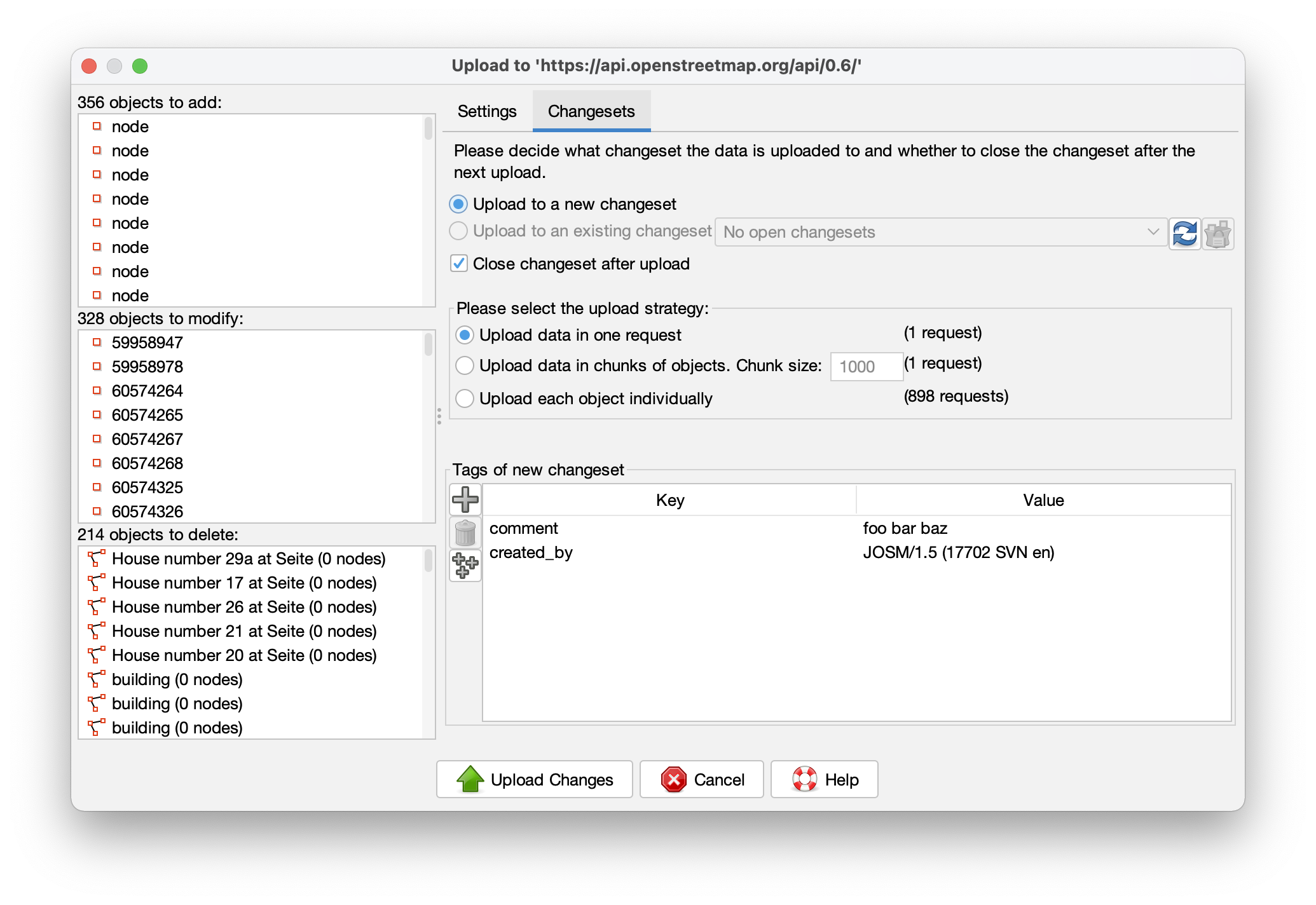
The current upload dialog wastes plenty of space (typical monitors have a 16:9 or 16:10 aspect ratio).
I propose to make the wider, and to use a vertical split for displaying the object lists and the settings:
Fixes #4144.
Attachments (4)
Change History (18)
by , 5 years ago
| Attachment: | Screenshot 2021-04-03 at 12.17.57.png added |
|---|
by , 5 years ago
| Attachment: | Screenshot 2021-04-03 at 12.18.02.png added |
|---|
comment:1 by , 5 years ago
| Description: | modified (diff) |
|---|
comment:2 by , 5 years ago
comment:3 by , 5 years ago
My observations:
- the 'Tags of new changeset' part not aligned to the bottom of the window
- the 'Settings' tab meaning a bit overlaps with 'Changesets' because both are a changeset property. Maybe reword to Description and Settings? Take into consideration that I'm not a native speaker.
comment:4 by , 5 years ago
| Description: | modified (diff) |
|---|
by , 5 years ago
| Attachment: | Screenshot 2021-04-03 at 14.04.21.png added |
|---|
comment:5 by , 5 years ago
comment:6 by , 5 years ago
+1, much better use of space on 16:9.
Sliders to only show one side, like the history browser, could be added.
by , 5 years ago
| Attachment: | Screenshot_2021-04-03 iD editor.png added |
|---|
follow-up: 13 comment:11 by , 5 years ago
Nice, but I cannot move the divider. The mouse icon changes hovering over the vertical dots but that is the only noticeable effect. Maybe it depends on the laf, though.
Relative:URL: ^/trunk
Repository:UUID: 0c6e7542-c601-0410-84e7-c038aed88b3b
Last:Changed Date: 2021-04-07 23:41:13 +0200 (Wed, 07 Apr 2021)
Revision:17714
Build-Date:2021-04-08 01:30:56
URL:https://josm.openstreetmap.de/svn/trunk

Identification: JOSM/1.5 (17714 en) Linux Debian GNU/Linux 10 (buster)
Memory Usage: 635 MB / 768 MB (101 MB allocated, but free)
Java version: 11.0.9.1+1-post-Debian-1deb10u2, Debian, OpenJDK 64-Bit Server VM
Look and Feel: com.formdev.flatlaf.FlatDarkLaf
Desktop environment: GNOME
comment:12 by , 5 years ago
Strange, today it works, but not for the whole width of the dialog. Is it possible to have these little arrows to hide on side for good like in history browser and the horizontal one in Relation Editor. Thanks in advance.
follow-up: 14 comment:13 by , 5 years ago
Replying to skyper:
Nice, but I cannot move the divider.
The left and right side have a minimum width. If you have the window on minimal width you cannot move the divider.
comment:14 by , 5 years ago
Replying to Klumbumbus:
Replying to skyper:
Nice, but I cannot move the divider.
The left and right side have a minimum width. If you have the window on minimal width you cannot move the divider.
Now I have a source with ~200 characters and I cannot move the divider in fullscreen.
Please, can we have the two small arrors to hide one side for good. Thanks.


Great idea, I was thinking the same recently.