

#11445 closed enhancement (fixed)
[PATCH] Change POI icons: accommodation and food
| Reported by: | Yarl | Owned by: | Yarl |
|---|---|---|---|
| Priority: | normal | Milestone: | 15.08 |
| Component: | Internal mappaint style | Version: | |
| Keywords: | Cc: | naoliv |
Description
This patch changes icons of accommodation and food group to SVG icons taken from two GitHub repos: gravitystorm/openstreetmap-carto and nebulon42/osmic. Goal is to standardize icons across OSM, if it will be accepted, I will continue with other icons.
Attachments (7)
Change History (42)
by , 11 years ago
| Attachment: | new-icons-food-and-accommodation.patch added |
|---|
by , 11 years ago
| Attachment: | accommodation.zip added |
|---|
by , 11 years ago
comment:1 by , 11 years ago
Zip files contains directories from path images/styles/standard. Some files were added, old ones removed.
comment:2 by , 11 years ago
| Cc: | added |
|---|
comment:3 by , 11 years ago
| Summary: | [PATCH] Change POI icons → [PATCH] Change POI icons: accommodation and food |
|---|
comment:4 by , 11 years ago
Whats the license of these icon? Are they identifiable at a size of 16px?
comment:5 by , 11 years ago
Both source repos are on CC0.
Icons looks OK for me, exactly like on osm.org.
follow-up: 8 comment:6 by , 11 years ago
@team: any general comments to the unification of the icons with the mapnik style?
comment:7 by , 11 years ago
I like the suggested icons for accommodation, but would prefer the current JOSM icons for cafe, fast food, pub and biergarten.
follow-up: 9 comment:8 by , 11 years ago
Replying to Klumbumbus:
@team: any general comments to the unification of the icons with the mapnik style?
A map is not the same as an editor, so different design goal leads to different icon sets. Colorful icons make sense for JOSM as they are easier to recognize. On a map, you have to care about overall aesthetic look.
comment:9 by , 11 years ago
Replying to bastiK:
A map is not the same as an editor, so different design goal leads to different icon sets. Colorful icons make sense for JOSM as they are easier to recognize. On a map, you have to care about overall aesthetic look.
Sounds reasonable. Some mapnik icons do not work anyway for JOSM like highway=traffic_signals, barrier=gate|lift_gate|bollard, amenity=bank|place_of_worship. I also think it is better to have more colorful icons instead of all shops purple. But I think we can replace some awful JOSM icons (like for optician). Also replacing some png by svg is a good thing.
comment:10 by , 11 years ago
Maybe I'll add my rationale for this change. Presonally (and I know it's not only my opinion) I prefer unification of icons because it's easier to find in menu and also on map. Frankly, sometimes it's hard to guess what is depicted on current JSOM icons - icons for osm.org are definitely better designed.
I can add some screenshots, but current latest code on repo gives me RuntimeException (Win 8 + NetBeans 8; build log here: http://pastebin.com/Y8LzgVxv)
Edit: most of the icons (all in this change) are SVG so different color for every menu is definitely possible).
by , 11 years ago
| Attachment: | iconcomp.png added |
|---|
comment:11 by , 11 years ago
comparison screenshoot of current state at http://www.openstreetmap.org/#map=19/50.84661/12.93826

follow-up: 13 comment:12 by , 11 years ago
Not so related with this ticket, but the butcher icon is missing in JOSM?
comment:13 by , 11 years ago
Replying to naoliv:
Not so related with this ticket, but the butcher icon is missing in JOSM?
No, it is available.
by , 11 years ago
comment:14 by , 11 years ago
Another thing is, that you often use aerial imagery background in JOSM and you need colorful icons to see them. Icons with only one color are often hard to see. So we would atleast need a white background for these icons.

comment:15 by , 11 years ago
| Milestone: | → 15.05 |
|---|

by , 11 years ago
follow-up: 20 comment:19 by , 11 years ago
| Owner: | changed from to |
|---|---|
| Status: | new → needinfo |
Yarl, can you provide icons for hotel, motel and hostel with white background, where the blue part does not touch the border of the icon? Because with a simple white background attached this is not really an improvement to current state:

follow-up: 21 comment:20 by , 11 years ago
Replying to Klumbumbus:
Yarl, can you provide icons for hotel, motel and hostel with white background
is it the only remaining thing to do? I'd like to close this ticket in this release :)
comment:21 by , 11 years ago
Replying to Don-vip:
Replying to Klumbumbus:
Yarl, can you provide icons for hotel, motel and hostel with white background
is it the only remaining thing to do? I'd like to close this ticket in this release :)
Yes, but the important part is "where the blue part does not touch the border of the icon"
comment:22 by , 11 years ago
OK guys, tomorrow there is a bank holiday in Poland, so I'll be offline until end of week. You can wait or close this issue. I'll deliver icons next week.
comment:24 by , 11 years ago
I created Osmic and most of the new icons in osm-carto. To customise the icons from Osmic you can use a script, it is possible to add shields, rounded corners, re-colour, adjust padding, re-size etc. Have a look at https://github.com/nebulon42/osmic/blob/master/tools/export.md. I'm happy to help, just let me know what you need.
by , 11 years ago
| Attachment: | osmic-josm-shields.zip added |
|---|
Osmic icons with white background 2px padding and 3px rounded corners
comment:26 by , 11 years ago
I have added an archive with all icons that I made with a white background, 2px padding between icon and shield border and 3px rounded corners. This was generated with the following config file: https://github.com/nebulon42/osmic/blob/master/tools/josm-shields.yaml
If you need different parameters or the icons in different form let me know.
comment:27 by , 11 years ago
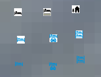
Thanks nebulon, here's how they look like on map. I used shield icons for map and icons with transparent backgroud for menu.

comment:28 by , 11 years ago
Looks fine to me. Having all icons in the same (black/grey) colour would also be an option (better contrast on the map).
comment:35 by , 11 years ago
| Component: | Core → Internal mappaint style |
|---|
patch