

#10067 closed defect (fixed)
elemstyle.mapcss: text is displayd twice because of text:auto of fixme
| Reported by: | Klumbumbus | Owned by: | team |
|---|---|---|---|
| Priority: | normal | Milestone: | 14.05 |
| Component: | Internal mappaint style | Version: | |
| Keywords: | Cc: |
Description
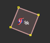
Look at this node in JOSM. It has addr:housenumber and fixme=* (because addr:street is not clear). With the new elemstyle.mapcss the housenumber is displayed twice, see screenshot:

I suggest either to remove the text from the fixme, because it is not needed, or to move the fixme from core_fixme layer to default layer. (The second one would also prevent to display the fixme icon together with other icons. I'm not sure if this is good or bad.)
Attachments (6)
Change History (21)
by , 12 years ago
by , 12 years ago
| Attachment: | fixme2.png added |
|---|
comment:1 by , 12 years ago
follow-up: 3 comment:2 by , 12 years ago
For the text, I agree.
Would you suggest to show only the icon or only the fixme symbol?
The idea with this overlay is, that you see the fixme tag immediately, but also the normal feature. What about a smaller symbol, slightly displaced from the center?
comment:3 by , 12 years ago
Replying to bastiK:
For the text, I agree.
Would you suggest to show only the icon or only the fixme symbol?
only the fixme symbol
What about a smaller symbol, slightly displaced from the center?
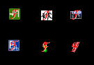
That would also be a good solution. Currently it looks bad in my opinion, espacially for shop=curtain (down right in the example picture).
comment:4 by , 12 years ago
How about a red circle (triangle) around the icon with a small, red f symbole on one side ?
I always hated the lack of information due to the missing icon for the main tag.
by , 12 years ago
| Attachment: | fixme with question mark.png added |
|---|
follow-up: 6 comment:5 by , 12 years ago
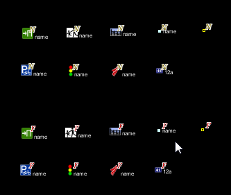
I tried some styles with circle, square and triangle, but they all look not so good in combination with different icons. So my suggestion is now:

follow-ups: 7 15 comment:6 by , 12 years ago
Replying to Klumbumbus:
I tried some styles with circle, square and triangle, but they all look not so good in combination with different icons. So my suggestion is now:
Is it possible to only use it if there is an additional icon but leave it big and centered without additional icon ?
by , 12 years ago
| Attachment: | fixme with question mark, big without icon.png added |
|---|
by , 12 years ago
| Attachment: | fixme with question mark big without icon.png added |
|---|
follow-up: 11 comment:7 by , 12 years ago
(sorry, uploaded same picture twice; didnt know comma not supportet in [[Image()]].)
Replying to skyper:
Is it possible to only use it if there is an additional icon but leave it big and centered without additional icon ?
This way?

by , 12 years ago
| Attachment: | fixme result.png added |
|---|

comment:11 by , 12 years ago
Replying to Klumbumbus:
Replying to skyper:
Is it possible to only use it if there is an additional icon but leave it big and centered without additional icon ?
This way?
Nice, that's what I had in mind. Logically the same is true for note=*.
follow-up: 13 comment:12 by , 12 years ago
I think the solution from bastiK is good. If you want to display a big symbol if there is no other icon then we need big versions of the F and N annotation which can be displayed centered. I think using different symbols for the same thing would be bad (old and new fixme symbol and old and new note symbol).
comment:13 by , 12 years ago
Replying to Klumbumbus:
I think the solution from bastiK is good. If you want to display a big symbol if there is no other icon then we need big versions of the
FandNannotation which can be displayed centered. I think using different symbols for the same thing would be bad (old and new fixme symbol and old and new note symbol).
We should use .svg icons then.
comment:14 by , 12 years ago
I don't know if you can put symbols on nodes displaced from the centre in mapcss. At least it is only documented for text at Help/Styles/MapCSSImplementation.
comment:15 by , 12 years ago
Replying to skyper:
Is it possible to only use it if there is an additional icon but leave it big and centered without additional icon ?
This is technically possible (with the caveat that it wouldn't work well with a second style file that overrides some icons). I tried both options and decided that the current solution looks more consistent.
I just tested some more icons. I think it would be the best to move fixme to default layer, because it looks ugly this way:
