

Opened 13 years ago
Last modified 12 years ago
#9532 closed defect
automatic validation results at upload look ugly — at Version 2
| Reported by: | aceman | Owned by: | team |
|---|---|---|---|
| Priority: | minor | Milestone: | 14.01 |
| Component: | Core validator | Version: | |
| Keywords: | Cc: |
Description (last modified by )
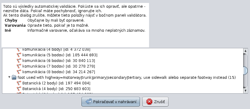
If there is a long validation warning text in the upload dialog, the dialog looks ugly. The validation results pane is wider than the descriptory text above it. Try to align them somehow.

Change History (3)
by , 13 years ago
| Attachment: | bug-validator-dialog-upload.png added |
|---|
comment:1 by , 13 years ago
| Component: | Core → Core validator |
|---|---|
| Priority: | normal → minor |
comment:2 by , 13 years ago
| Description: | modified (diff) |
|---|
Note:
See TracTickets
for help on using tickets.
screenshot of the dialog