

Opened 12 years ago
Last modified 12 years ago
#9532 closed defect
automatic validation results at upload look ugly — at Initial Version
| Reported by: | aceman | Owned by: | team |
|---|---|---|---|
| Priority: | minor | Milestone: | 14.01 |
| Component: | Core validator | Version: | |
| Keywords: | Cc: |
Description
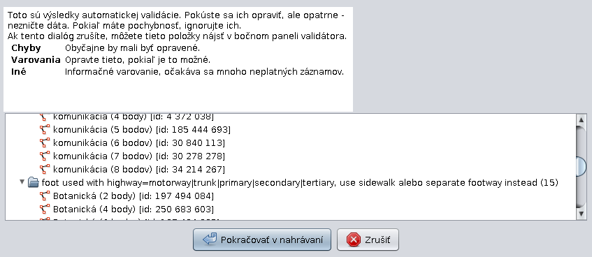
If there is a long validation warning text in the upload dialog, the dialog looks ugly. The validation results pane is wider than the descriptory text above it. Try to align them somehow.
Note:
See TracTickets
for help on using tickets.
screenshot of the dialog