

#3409 closed defect (fixed)
Save Dialog: icons have different size
| Reported by: | Owned by: | team | |
|---|---|---|---|
| Priority: | normal | Milestone: | |
| Component: | Core | Version: | latest |
| Keywords: | Cc: |
Description (last modified by )
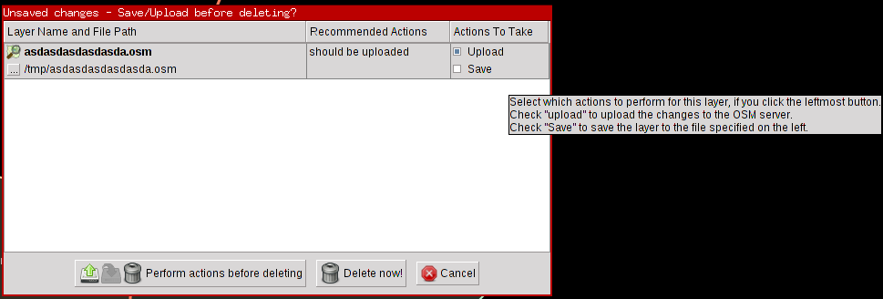
The dimensions & design of the new save dialog are such that it has a lot of wasted space and some of the text can't be read due to it overflowing the UI elements.
See attached screenshot.
Attachments (6)
Change History (25)
by , 15 years ago
| Attachment: | save-dialog.png added |
|---|
comment:2 by , 15 years ago
Replying to Gubaer:
And what would you like to have changed?
I'd like to have a dialog where all the text is readable and which doesn't take up too much space in proportion to the information it's displaying.
How exactly it should be designed I don't know. I just filed a bug to note the problem with the current one so that it's noted in the tracker.
comment:3 by , 15 years ago
Anyway, if you have some kind of sketch or scribble of what your ideal dialog would look like please post it here.
comment:4 by , 15 years ago
Not sure if that's a good idea: turn the table by 90 degrees. It uses the available space better in the common case, but might be confusing if there are two or more unsaved osm layers. On the other hand I can read timetables pretty easily so one might get used to it after having seen it a few times. Any comments on this?
comment:5 by , 13 years ago
I wouldn't change the orientation (turn by 90°). Filenames tend to be long and when having ⩾2 layers, more space is wasted than now.
Perhaps one could combine the columns "Should upload?" and "Upload": By default, "Upload" is checked whenever "Should upload?" is yes (is that correct?). When the default is changed, a (e.g. light yellow) background color could indicate/visualize that deviation. Thus, one could drop the columns "Should upload?" and "Should save?".
Btw, funny behaviour in r4337: I can drag the column headers to the left/right, but the content does not move (see attachment:drag_headers.png).
by , 13 years ago
| Attachment: | drag_headers.png added |
|---|
comment:6 by , 13 years ago
I think that dragging is nearly nowhere supported in JOSM, as we stayed on Java 1.5 for a long time. Nowadays either it should be disallowed or supported correctly. The later is better, disallowing is easier :-)
Reducing columns seems useful to me.
follow-up: 8 comment:7 by , 13 years ago
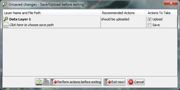
I had a different idea on how to design this dialog, but haven't looked into it. Since you can actually edit the save-to path in the dialog itself it probably will take more than one afternoon to update the dialog. Anyway, suggested layout:
+-----------------------------------------------------------------------+
| [IC ] *some OSM Layer* /(should be uploaded)/              [X] Upload |
| [ ON] save as: /click here to choose save path/            [ ] Save   |
|                                                                       |
| [IC ] *osmlayer2* /(should be uploaded) (should be saved)/ [X] Upload |
| [ ON] save as: /home/stefan/osm/osmlayer2.osm              [X] Save   |
+-----------------------------------------------------------------------+
| [Perform sel. actions before exiting] [Exit immediately] [Cancel]     |
+-----------------------------------------------------------------------+
with /italic/ and *bold* and the entries should alternate in background or be separated by a thin line.
comment:8 by , 13 years ago
Replying to xeen:
Wow, I like your suggestion very much! It gets away from the boring table and shows all relevant information to the user (in contrast to the current solution, which hides a lot in tooltips)!
comment:9 by , 12 years ago
| Description: | modified (diff) |
|---|
You can try the WIP using this jar if you do not want to build yourself: http://goo.gl/Mr2Rk
Also, now is the time to ask for features ;)
by , 12 years ago
| Attachment: | Test.class added |
|---|
The cursor is over the last cell. The "perform actions" button would be disabled, if upload was unchecked, too. If save was checked, the middle icon wouldn’t be greyed out.
by , 12 years ago
| Attachment: | redesign_screen.png added |
|---|
The cursor is over the last cell. The "perform actions" button would be disabled, if upload was unchecked, too. If save was checked, the middle icon wouldn’t be greyed out.
comment:10 by , 12 years ago
I’ve implemented everything I wanted to, updated patch, screen and the test build at http://goo.gl/Mr2Rk . I’ll let it sit for a while and re-check for bugs; if none are found, I’ll commit it like suggested.
by , 12 years ago
| Attachment: | josm_cancel.png added |
|---|
comment:12 by , 12 years ago
| Resolution: | fixed |
|---|---|
| Status: | closed → reopened |
Nice job :) Is it just possible to fix Cancel image size ? It's a bit smaller than the other ones:

comment:13 by , 12 years ago
Yes, either by providing an icon with the correct dimension (24x24 instead of 16x16) or by upscaling. While latter would look decent enough I would still prefer the former as I feel uncomfy installing a hack for something trivial like this. And scaling icons should definitely not the way to go to implement it generally :)
comment:15 by , 12 years ago
| Summary: | New save dialog has overflowing text & wasted space → Save Dialog: icons have different size |
|---|
Now I’m confused. The cancel icon *has* the correct size. It’s 24x24 Pixels and it is loaded correctly (i.e. Java says it’s 24x24). However, somewhere in between it gets resized to 20 Pixels in height and I have no idea why… it seems to work fine for the other icons, and even if I switch the icon it still gets resized. Apparently there’s some magic related to the cancel button…
comment:16 by , 12 years ago
Okay, there’s some code which resizes all icons to 20x20 pixel… and it applies to all icons, even the larger ones. I don’t get why they don’t render resized, although they definitely should.
comment:18 by , 12 years ago
Hmm, why is SideButton used in that dialog? As the name says it is designed to be used in ToggleDialog on right side.
comment:19 by , 12 years ago
I asked myself the same thing. I posted on the mailing list about this, but either it’s not yet been processed or it rejected it due to my new mail address (which isn’t subscribed).
The new save dialog