

Opened 8 years ago
Last modified 6 years ago
#12085 new enhancement
Droid fonts no longer shipped by Android upstream, switch to Noto fonts
| Reported by: | sebastic | Owned by: | team |
|---|---|---|---|
| Priority: | normal | Milestone: | |
| Component: | Core mappaint | Version: | tested |
| Keywords: | font droid noto | Cc: | sebastic |
Description
As reported in Debian Bug #804683, Android upstream stopped shipping Droid fonts and its been declared that Noto fonts will be superseding the Droid fonts.
The maintainers of the fonts-droid package in Debian have decided to drop the package, and have requested all reverse dependencies to switch to the Noto fonts.
The JOSM Debian package will be updated to use the Noto fonts instead of the Droid fonts, it's probably a good idea to replace the embedded copies of the Droid font in JOSM with Noto too, to keep using an actively maintained font.
Attachments (11)
Change History (37)
comment:1 by , 8 years ago
by , 8 years ago
comment:2 by , 8 years ago
I created the gif in JOSM, when I compare the fonts in MS Word they look more similar at the small sizes. I don't know if the font rendering can be adjusted in JOSM or JAVA.
by , 8 years ago
| Attachment: | use-noto-font.patch added |
|---|
by , 8 years ago
| Attachment: | NotoSans-Regular.ttf added |
|---|
by , 8 years ago
| Attachment: | NotoSans-Bold.ttf added |
|---|
comment:4 by , 8 years ago
attachment:use-noto-font.patch includes the changes to use the Noto instead of Droid font.
The regular & bold variants are also attached (attachment:NotoSans-Regular.ttf & attachment:NotoSans-Bold.ttf) these need to be added to data/fonts/ and data/fonts/DroidSans.ttf & data/fonts/DroidSans-Bold.ttf removed.
comment:5 by , 8 years ago
I agree with Klumbumbus that the current Droid font font looks significantly cleaner than Noto. Unless the rendering in Java with the Noto font can be improved, we shouldn't switch.
It seems, the Debian fonts-people aren't aware of the issue?
by , 8 years ago
| Attachment: | josm-noto.png added |
|---|
follow-up: 7 comment:6 by , 8 years ago
Have any of you tested the Noto font with JOSM?
The josm (0.0.svn8969+dfsg-4~exp1) Debian package now uses the Noto font, and I even at font size 8 the text is sharp.
Have a look at attachment:josm-noto.png
comment:7 by , 8 years ago
Replying to sebastic:
The josm (0.0.svn8969+dfsg-4~exp1) Debian package now uses the Noto font, and even at font size 8 the text is sharp.
Have a look at attachment:josm-noto.png
Sorry, but that is not sharp, see attachment:noto2.gif, which compares the fonts at your example place. (The noto font an my system looks the same like on your screenshot)
For my screenshots I installed Noto Sans font from http://www.google.com/get/noto/ and used an additional mappaint style:
*::* {
    font-family: "Noto Sans";
}
Revision: 9000
Repository Root: http://josm.openstreetmap.de/svn
Relative URL: ^/trunk
Last Changed Author: Klumbumbus
Last Changed Date: 2015-11-10 19:06:04 +0100 (Tue, 10 Nov 2015)
Build-Date: 2015-11-11 02:32:35
URL: http://josm.openstreetmap.de/svn/trunk
Repository UUID: 0c6e7542-c601-0410-84e7-c038aed88b3b
Last Changed Rev: 9000

Identification: JOSM/1.5 (9000 de) Windows 7 32-Bit
Memory Usage: 247 MB / 742 MB (123 MB allocated, but free)
Java version: 1.8.0_65, Oracle Corporation, Java HotSpot(TM) Client VM
VM arguments: [-Djava.security.manager, -Djava.security.policy=file:C:\Program Files\Java\jre1.8.0_65\lib\security\javaws.policy, -DtrustProxy=true, -Djnlpx.home=<java.home>\bin, -Djnlpx.origFilenameArg=C:\Program Files\josm-latest-bla.jnlp, -Djnlpx.remove=true, -Djava.util.Arrays.useLegacyMergeSort=true, -Djnlpx.heapsize=256m,768m, -Djnlpx.splashport=63704, -Djnlpx.jvm=<java.home>\bin\javaw.exe, -Djnlpx.vmargs=LURqYXZhLnV0aWwuQXJyYXlzLnVzZUxlZ2FjeU1lcmdlU29ydD10cnVlAA==]
Dataset consistency test: No problems found
My screen: 22" 1680*1050 px
by , 8 years ago
comment:9 by , 8 years ago
Added an option to configure the text anti-aliasing. Unfortunately, there is no improvement in either font when setting it to something other than "default".
comment:10 by , 8 years ago
| Component: | Core → Core mappaint |
|---|---|
| Keywords: | font droid noto added |
| Type: | defect → enhancement |
by , 8 years ago
| Attachment: | s1-noto.png added |
|---|
by , 8 years ago
| Attachment: | s1-droid.png added |
|---|
comment:11 by , 8 years ago
Here is a more practical example:
(a)

(b)

(a) is Noto and (b) is Droid. You can see that some labels are barely readable in the upper image but fairly clear in the lower screenshot.
I'm not saying it would be the end of the world to switch to Noto as our default rendering font. But why? The end of maintenance doesn't affect us very much. For space reasons we cannot ship the full Unicode range anyways. The Droid font was/is widely-used, so it should be sufficiently stable.
follow-up: 13 comment:12 by , 8 years ago
I agree that the Noto font in JOSM is not as clear as Droid in your examples, but better than the initial comparsion GIF.
Because the Droid font is no longer maintained, and Noto is positioned as its replacement, improving the Noto font to be on par with Droid should be the way forward now. Sticking to unmaintained components is not good software engineering.
In noto issue #556 behdad comments:
Is it the hinted noto? This is a problem best answered on the freetype-devel mailing list, and only after inspecting the actual fonts used and the FreeType settings involved.
This actually differs between our tests, I use Linux exclusively and your tests have been on Windows so far. My tests use the hinted noto, but I have no clue what Windows uses.
I'll see what I can do to get the Noto font improved upstream, but I don't care enough about this issue to press very hard. I've switched the josm Debian package to the actively maintained Noto font, so it's no longer affected by the Droid font (and its packaging) being unmaintained.
follow-up: 16 comment:13 by , 8 years ago
Replying to sebastic:
In noto issue #556 behdad comments:
Is it the hinted noto? This is a problem best answered on the freetype-devel mailing list, and only after inspecting the actual fonts used and the FreeType settings involved.
This is slightly over my head.
This actually differs between our tests, I use Linux exclusively and your tests have been on Windows so far. My tests use the hinted noto, but I have no clue what Windows uses.
The last screenshots (s1-noto.png, s1-droid.png) have been done on Linux using the font files you attached to this ticket:
Build-Date: 2015-11-11 22:37:11
Revision: 8993
Is-Local-Build: true

Identification: JOSM/1.5 (8993 SVN en) Linux Ubuntu 14.04.3 LTS
Memory Usage: 309 MB / 1763 MB (69 MB allocated, but free)
Java version: 1.7.0_85, Oracle Corporation, OpenJDK 64-Bit Server VM
Java package: openjdk-7-jre:amd64-7u85-2.6.1-5ubuntu0.14.04.1
I'll see what I can do to get the Noto font improved upstream, but I don't care enough about this issue to press very hard. I've switched the josm Debian package to the actively maintained Noto font, so it's no longer affected by the Droid font (and its packaging) being unmaintained.
Alright, I think we can close the ticket, Klumbumbus?
follow-up: 15 comment:14 by , 8 years ago
Replying to sebastic:
I agree that the Noto font in JOSM is not as clear as Droid in your examples, but better than the initial comparsion GIF.
No, it is just that you see a bigger difference, when it is compared directly like in the gif. All the Noto screenshots we have seen in this ticket show the same rendering! See the following image. The second and third line show the same.

You can also open the two images of bastiK in 2 tabs and switch the tabs. You can see that the difference is similar to the initial gif.
improving the Noto font to be on par with Droid should be the way forward now.
Yes, that would be the best.
Sticking to unmaintained components is not good software engineering.
I agree, however replacing a working component by a worse one is not good as well.
In noto issue #556 behdad comments:
Is it the hinted noto? This is a problem best answered on the freetype-devel mailing list, and only after inspecting the actual fonts used and the FreeType settings involved.
This actually differs between our tests, I use Linux exclusively and your tests have been on Windows so far. My tests use the hinted noto, but I have no clue what Windows uses.
I don't know what windows does, but why should it not use the hinted version? And since we come to the same rendering result in linux and windows it is most likely that it uses hinting.
I'll see what I can do to get the Noto font improved upstream
Thanks.
by , 8 years ago
| Attachment: | rendering comparison.png added |
|---|
comment:15 by , 8 years ago
Replying to Klumbumbus:
Replying to sebastic:
This actually differs between our tests, I use Linux exclusively and your tests have been on Windows so far. My tests use the hinted noto, but I have no clue what Windows uses.
I don't know what windows does, but why should it not use the hinted version? And since we come to the same rendering result in linux and windows it is most likely that it uses hinting.
OpenJDK uses FreeType for font rendering and (afaik) Oracle Java has a proprietary library (T2K), so one should expect differences.
follow-ups: 18 19 comment:16 by , 8 years ago
Replying to bastiK:
Alright, I think we can close the ticket, Klumbumbus?
With the current Noto rendering result we should not switch. We can keep the ticket open and wait if Noto can be improved.
Unfortunately I think I'm not able to help in the improvement process, but only make screenshoots and compare before and after :)
Do I understand correctly that all Debian users (with the latest updates) now use the Noto font in the MapView?
follow-up: 21 comment:17 by , 8 years ago
Yes, the switch to the Noto font has been made in josm (0.0.svn8969+dfsg-4~exp1) that was uploaded to experimental two days ago, and today josm (0.0.svn8969+dfsg-4) has been uploaded to unstable from where it will transition to testing for inclusion in the next stable release, and synced into Ubuntu for the xenial release.
comment:18 by , 8 years ago
| Milestone: | 15.11 |
|---|
Replying to Klumbumbus:
With the current Noto rendering result we should not switch. We can keep the ticket open and wait if Noto can be improved.
Agreed we won't switch now, but we can wait some months to see how the situation evolves.
comment:19 by , 8 years ago
| Milestone: | → 15.11 |
|---|
Replying to Klumbumbus:
Replying to bastiK:
Alright, I think we can close the ticket, Klumbumbus?
With the current Noto rendering result we should not switch. We can keep the ticket open and wait if Noto can be improved.
Fine with me.
Do I understand correctly that all Debian users (with the latest updates) now use the Noto font in the MapView?
Yes, but users downloading the jar file from our website (or install from our deb-repository) are obviously not affected by this change.
comment:20 by , 8 years ago
| Milestone: | 15.11 |
|---|
comment:21 by , 8 years ago
Replying to sebastic:
Yes, the switch to the Noto font has been made in josm (0.0.svn8969+dfsg-4~exp1) that was uploaded to experimental two days ago, and today josm (0.0.svn8969+dfsg-4) has been uploaded to unstable from where it will transition to testing for inclusion in the next stable release, and synced into Ubuntu for the xenial release.
Then we should hope that the Noto rendering result will be improved :)
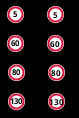
(With Noto also the special maxspeed sign rendering is a bit off, but that is not such crucial.)

by , 8 years ago
| Attachment: | maxspeed.png added |
|---|
comment:22 by , 8 years ago
Replying to sebastic:
I've forwarded your comments & GIF in noto issue #556.
The bugreport has been closed.
Apparently, one of the freetype developers is working on hinted noto, but I'm not sure in what way he is collaborating with the noto team.
by , 6 years ago
| Attachment: | noto-droid2017-11.png added |
|---|
comment:24 by , 6 years ago
See screenshot:

(1) Top: 8pt Noto as distributed in the
fonts-noto-hintedpackage of Ubuntu 17.04
(2) Center: 8pt Noto-hinted as downloaded from the noto website (2017-10-24 release)
(3a) Bottom left: 8pt Droid
(3b) Bottom right: 9pt Droid
As you can see, the situation has improved somewhat - (2) is a little larger, but also clearer than (1). There is a difference for hinting turned on or off in (2) while for (1) there is no difference. This means, there has been some improvement, but it hasn't propagated to the 17.04 release of Ubuntu.
Anyway, Droid still looks significantly better at 8/9 pt...
The main point why we use Droid Sans was, that it is sharp at all font sizes beginnig at size 8 (see ticket:10301#comment:16). While testing Noto Sans, I see that it is unsharp at size 8, 9 and 10, even a bit at size 11, which would be a big step backwards, see gif.